Difference between revisions of "Modding:Monster Making Guide Part 1"
| Line 5: | Line 5: | ||
*[[Modding:Monster Making Guide Part 2|Monster Making Guide Part 2: Fusion Forms]] | *[[Modding:Monster Making Guide Part 2|Monster Making Guide Part 2: Fusion Forms]] | ||
*[[Modding:Monster Making Guide Part 3|Monster Making Guide Part 3: Integration & Implementation]] | *[[Modding:Monster Making Guide Part 3|Monster Making Guide Part 3: Integration & Implementation]] | ||
| + | Downloadable project files for this section: | ||
| + | |||
| + | * Example .ase file for a monster's battle sprite | ||
| + | * Example .ase file for a monster's world sprite | ||
== Step 1: What You'll Need == | == Step 1: What You'll Need == | ||
Revision as of 14:31, 18 May 2023
This article is part of a series of tutorials intended on teaching the reader how to create their own monster mods for the PC versions of Cassette Beasts. We advise the reader familiarise themselves with the Mod Developer Guide first.
This part will focus on concept art, pixel art and animating a monster. As we go, we will be designing a monster from scratch.
- Monster Making Guide Part 1: Concept, Art & Animation
- Monster Making Guide Part 2: Fusion Forms
- Monster Making Guide Part 3: Integration & Implementation
Downloadable project files for this section:
- Example .ase file for a monster's battle sprite
- Example .ase file for a monster's world sprite
Step 1: What You'll Need
Before we start, you will need the following pieces of software:
- Aseprite or LibreSprite: These are both pixel art programs that excel in creating pixel art assets and can export the frame data necessary to be read by Cassette Beasts. Aseprite is a premium software package but Libreoffice is a free alternative.
- Godot 3.5.1: As explained in the Mod Developer Guide, this editor is necessary for editing configuration files for implementation.
- An audio editor (optional): This is to create a battle cry for your monster. We use Audacity, which is free and open-source, and very easy to use.
- A digital art program (optional): This is useful for concept art and also creating the "monster sticker". We use Photoshop, but free alternatives include Paint.net, Krita and GIMP.
There is enough free options here that it doesn't have to cost you anything to begin modding!
Step 2: Concept & Creation
Designing your Monster
Whilst you are free to design a monster directly as a sprite, we recommend concepting your monster on paper or digitally first.
It's much easier to design a solid sprite if you have concept art to work from.
- Think about what role you want your monster to have in the game, and how you would want it to act.
- Consider what elemental type it would.
- Consider what moves it would use in battle.
Shape
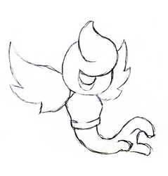
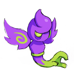
The shape and silhouette of your monster are important in distinguishing them. For this guide, we're going to use a monster we are going to call Wraithand. Wraithand is a ghostly astral-type creature with a big hand for a tail. Wraithand started as a pencil sketch that was painted digitally after scanning.
Colours
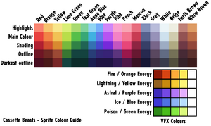
Cassette Beasts uses a very limited colour palette for its monsters - this helps them feel more like a "set" when displayed together. You don't have to use these colours when drawing concept art, but it is helpful!
Here is an image for all of the colours we use for monster sprites - You don't have to follow these exact rules (and not all of our monsters do) but it is a useful reference:
You will also notice that our monsters generally have one level of shading and occasional highlights, and are drawn assuming that light is being cast from the top-right of the sprite.
Cassette Beasts Monster Design Rules (Optional)
As a mod creator, you are free to design whatever you please - your monster forms don't even have to be monsters! However, if you are interested in designing a monster that matches the aesthetic of the existing monsters in the base game, there are some Do's and Don'ts we created in order to keep our monsters on the right path. Feel free to follow them if you wish!
| + Do feel free to design monsters that are as cute or as creepy as you want! |
| + Do try to make a design with a distinct silhouette and personality |
| + Do try and make a design that fits an elemental type, even if only lightly |
| + Do think about how this monster would attack |
| + Do give them an exciting pose that they’ll be seen in as a sprite |
| - Don’t make them overdetailed: larger monsters can afford to be more detailed, but in general pixel art restricts too much detail on characters. |
| - Don’t design monsters too close to existing characters, or direct parody characters |
| - Don’t begin and end at “elemental animal” for your design inspiration |
| - Don’t design monsters that are sexually explicit |
| - Don’t design monsters that are too violent or disturbing |
| - Don’t design monsters with a “human” skin tone or defined ethnicity |
| - Don’t design monsters that are culturally insensitive or appropriative |
Step 3: Creating your Sprite
Palettes
You can import this PNG file into Aseprite or Libreoffice to generate a palette.
Drawing your Battle Sprite
1: Finding the right size
It's important to think about how big you want your monster to be in the world of Cassette Beasts. As a house rule, all monster sprites are either the same size or bigger than the game's human sprites. For Wraithand, we're going to make it approximately "medium size", and try and fit it within a 64x64 pixel grid.
Remember: the bigger the sprite, the harder it will be to animate, so try and keep the sprite as small as you can get away with without losing too much detail!
Our first step will typically be to shrink our concept art to the pixel art scene to see what size fits.
2: Defining the Outline
After shrinking the concept art and deciding on the size of the sprite, we're going to trace our own art! Turning the reference art transparent, we'll define the outline of our sprite. Feel free to adjust the details as you go.
3: Filling in the Shading
Now we have the outline (and still have the concept art visible) we fill in the shading and any details (like the swirls on the wings). We also use darker shade pixels on parts of curves to help define their round shape further - this is called "anti-aliasing" and is a common technique in pixel art!
4: Filling the Colours
Hiding our concept art layer, we now fill in the rest of the colours. We're still adjusting the sprite as we go - for example, adding the side of the left eye in to help define the shape of face.
5: Colouring the Outline
The final step is to colour in the outline. Cassette Beasts has a generally consistent rule with outline colours:
- The underside of the outline is always black, as are parts around shaded areas.
- The parts of the outline that are "facing" the top right (the light source) are shaded in the 4th shade on our palette, the "Outline" tone.
- Parts that are facing upwards/not in the shade but are not pointing in the direction of the "light source" use the 5th shade, the darkest tone.
Following these rules we complete the rendering of our sprite! It's simpler than you'd think!
World Sprite (Optional)
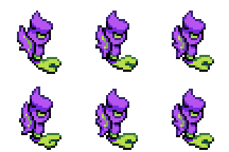
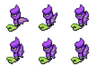
If you want to also design a roaming world monster to add into the game, the process is a lot simpler than the battle sprites! Of course, not every monster in Cassette Beasts has a "world sprite" so this isn't necessary.
1: Outline and Size
As a rule, the "world sprites" are roughly 50% of the scale of battle sprites - you can get a good indication of how big a monster's world sprite should be by shrinking its battle sprite down by half (which we have done here for reference). However, character sprites in the world often have much more "chibi" proportions, with bigger heads and smaller bodies. Keeping this in mind, we draw an outline for a simple world sprite for Wraithand.
2: Colouring
The colouring uses the same rules as with the battle sprite, except the "light source" is drawn directly from above. Feel free to simplify the details of the monster (or omit details entirely!) for the purpose of keeping the sprite bold, readable and simple. In this case, we have simplified the "swirls" on the wings.
Step 4: Animation & Tagging
Battle Sprite
For your battle sprite, your monster will need the following animations:
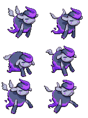
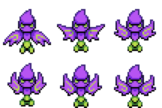
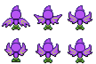
- idle - the monster's idle stance. Almost always 6 frames long; is 8 on some larger monsters. There tends to not be too much movement in this animation. Most animations play directly into "idle" after they've finished.
- alt_idle - an alternate idle that has an extra action in to break up the animation. This could be a flag of wings, a blink, or a spin of a weapon. This will have about a 1/4 chance of playing instead of the regular idle. Always loops back into "idle".
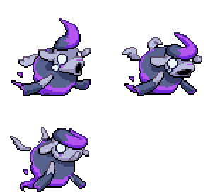
- windup - The animation right before the monster attacks, which is usually animated back-to-back with the attack. This shouldn't be too long as you don't want to make battles take longer than necessary. Typically 6-8 frames long, and starts from the end of the "idle" animation.
- attack - The point at which an attack "starts", right after the windup. This always has the monster returning to its "idle" state.
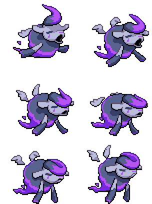
- hurt - A few dramatic frames of the monster reacting to being attacked. This tends to be a 3 frame animation, starting with a very dramatic reaction that resets to its "idle" position.
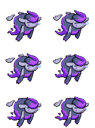
- sleep_idle/sleep_alt_idle - A looping animation of the monster asleep. Doesn't have to be high effort - you can simply copy the regular "idle" and give it closed eyes, if you wish! You will notice that this animation has two tags listed - the Cassette Beasts engine technically does support an "alt_idle" for the sleeping pose, but we don't use it and simply assign both tags to the same animation frames.
These names aren't just for reference - these are the names of the tags you must give your animation in Apesprite/LibreSprite when exporting your sprite sheet later.
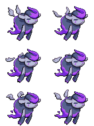
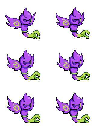
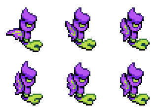
Here's an example of these animations for Bansheep's battle sprite sheet:
In Aseprite/LibreSprite, sections of your animation must be highlighted and "tagged" with the above listed names. For more information on tagging in Aseprite, check the official documentation here.
Some extra rules to consider:
- Monster animations should always be timed at 100ms per frame (the default in Aseprite).
- The monster's "idle" should always be centered in the canvas - even if there ends up being blank space around it once the canvas has been adjusted to fit attack animations etc.
- If your monster is meant to be positioned standing on the floor, then some part of the sprite should be lined up along the bottom row of pixels in the canvas.
Whilst the animation tags must be named correctly, there are no restrictions on layers (as the images are flattened into one layer upon export), so feel free to use layers however you please!
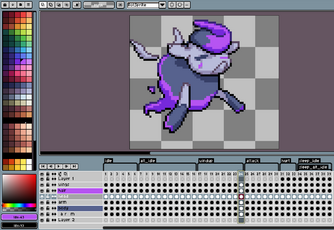
Here's a look at what the project files for the existing game monsters look like in Aseprite. You can see all the animation tags on the timeline at the bottom:
Following these guidelines, we animate our monster. Whilst we aren't going to go over the base principles of pixel art animation here, we do recommend the e-book Pixel Logic by Cassette Beasts' monster animator Michael Azzi as a great resource for learning!
Now we're all set to export these animations to the game!
World Sprite (Optional)
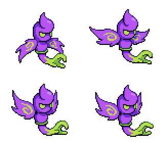
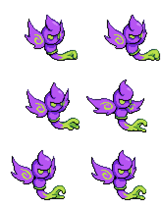
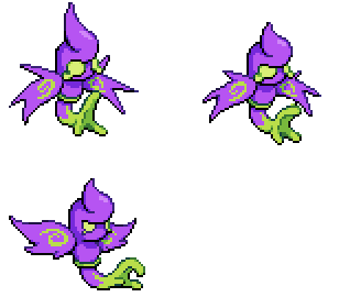
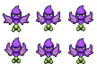
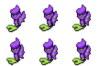
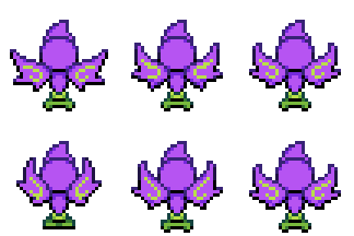
Since the behaviours of the "world monsters" can be entirely customised, the animation tags for them can be whatever you need. For the purpose of simplicity, however, we're going to give Wraithand a very straightforward "roaming and chasing" behaviour that is identical to multiple monsters in Cassette Beasts - for this, we have given it a set of four-directional sprites in both an "idle" state and a "run" state.
Step 5: Exporting & Sprite Sheets
The final thing left do to regarding the sprites is to export the sprite sheets. These are images that include every frame of a sprite's animation that the game loads.
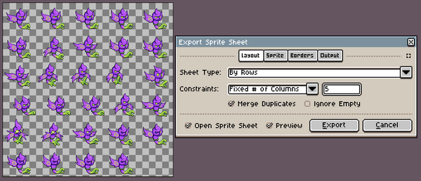
To export your sheet in Aseprite/LibreSprite, go to File > Export Sprite Sheet. In the "Export Sprite Sheet" settings box, we'll set some settings to best optimise our sprite sheet.
On the Layout tab, you will want to:
- Tick Merge Duplicates. This removes any duplicate frames from the sheet to save space.
- Set Sheet Type > By Rows.
- Constraints > Fixed # of Columns. Pick a number that arranges your sheet into as close as a square as you can get. This just helps save memory for loading assets.
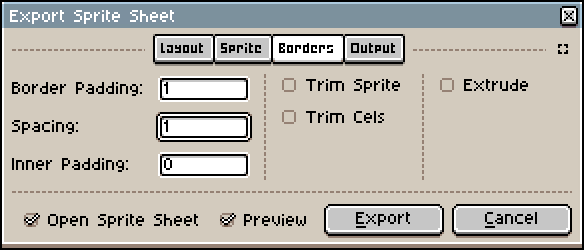
On the Borders tab, you'll want to set Border Padding and Spacing to 1. This helps prevent pixels bleeding across frames at points where they touch the edge of the canvas.
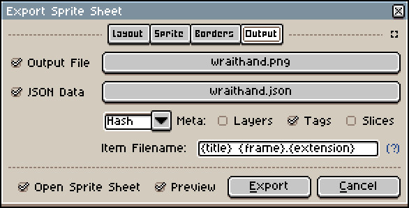
On the Output tab, make sure you're exporting both a .png and the JSON data. The .png Output file will be the sprite sheet, whilst the .json file is a text file that will tell the game engine which animations on the sprite sheet are which. Both of these need to have the same name so the engine knows they are linked.
The only Metadata needed to be exported are the Tags, so check that option.
These are the same export options needed for both the battle sprite sheets and the world sprite sheets - these won't be placed in the same directories however, so it might be good to sort them into separate folders ahead of time.
Next, we will set up Wraithand's Fusion Form! This guide continues in:
